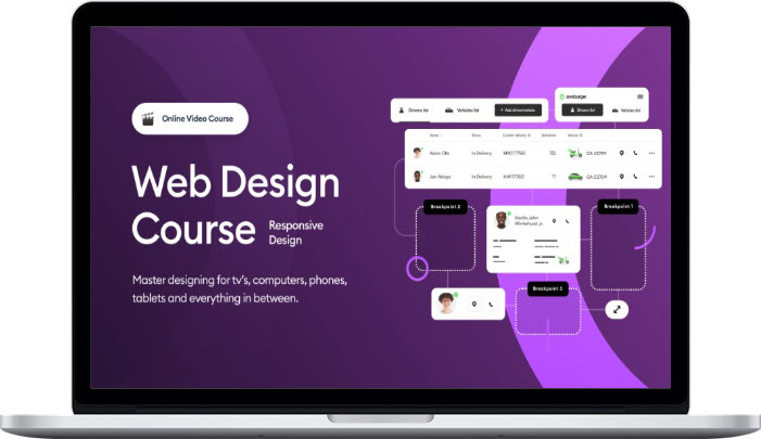
Michal Malewicz – Responsive Web Design Course
$49.00 Original price was: $49.00.$22.00Current price is: $22.00.
Content Proof: View Here!
Michal Malewicz – Responsive Web Design Course
Third and final part of the bestselling Web Courses is here!
Web design is a unique skill!
Most designers only do mobile apps and completely fail when facing a bigger canvas. Over the years I’ve worked on hundreds of projects for companies like Nickelodeon, Orange, BMW, Samsung and others!
That knowledge is distilled into three high quality courses teaching you basically all I know about web design.
And I have been doing web design since 1998
But responsive design is often neglected
Only about 1/4 of web designers can do responsive design RIGHT! Many simply use Figma Auto-Layout and automatically stretch the content. That is the WRONG way to do it!
Responsive web design is not about just fitting the content on a smaller (or bigger) display. It has to be the best possible user experience on that device, which requires more thought than just scaling it down and placing one thing on top of another.
But don’t worry!
I worked on so many complex responsive projects for real clients – often huge international corporations – that I know all the ins and outs of great responsive web design!
And for the first time ever I am sharing it with others in this COMPLETE RWD package
The courses
The course is nearly 4 hours of materials and cover all responsive design approaches including our secret techniques learned in complex, real client projects for the banking, fintech, medical and startup industries.
We will be designing in Figma, but you can also use Sketch or Adobe XD as the knowledge in the course is not Figma specific – it’s universal practices of great visual design mixed with our years of professional experience in the field.
What you will design?
Our approach is as always to inspire you to create a project of your own. We will show you the path and I will show multiple approaches to each section (and the header) so you can mix and match them and create something uniquely yours.
There’s already enough templates out there that all look the same!
We teach you how to make things yourself.
From scratch. Not just the HOW but also – most importantly THE WHY.
That way you can put the project in your portfolio and stand out from all those designers showing only mobile apps.
What You’ll Learn In Responsive Web Design Course?
- Designing for the mobile experience (UX breakdown and thought process for your functionalities)
- Defining the breakpoints
- Making data responsive
- How to determine the RWD type for a project – based on real world examples
- Responsive web apps – step by step
- Responsive Landing Page design – with complex sections
- How to talk about responsive web design in your portfolio and show examples
And a lot more…
About Author
Michal Malewicz is a highly skilled and experienced graphic designer and entrepreneur from Poland. He has a passion for design and has been involved in the design industry for many years. Michal is the founder of several successful companies, including Neoteric, a design agency that provides web development and design services to clients worldwide. He is also the creator of the Ultimate Design Toolkit, an online platform that offers a wide range of design resources and tools for designers, marketers, and entrepreneurs.
Michal is known for his expertise in design and entrepreneurship and has been featured in various publications, blogs, and events around the world. He has a strong commitment to helping other designers and entrepreneurs succeed, and he regularly shares his knowledge and insights through his blog and social media channels.
In addition to his work as a designer and entrepreneur, Michal is also a public speaker, mentor, and teacher. He has spoken at conferences and events on topics such as design thinking, entrepreneurship, and branding. Michal is a respected figure in the design community and is admired for his creativity, innovation, and leadership in the field of design and entrepreneurship.
Be the first to review “Michal Malewicz – Responsive Web Design Course” Cancel reply
You must be logged in to post a review.
Related products
Development & IT
Development & IT
Development & IT
Arielle Phoenix – Bulk Publishing System + AI-Integrated Spreadsheet
Development & IT
Development & IT
Development & IT
Development & IT
Development & IT








Reviews
There are no reviews yet.